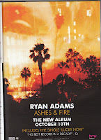
 This advert uses a basic colour scheme - black, with oranges and reds to provide contrast (due to the "Ashes & Fire" title to the album). In music magazines, the colour scheme tends to be black and white, so the adverts will look to break the mould and stand out more. I will look to use colours that will stand out and catch the attention of readers by being different. The writing is in bold font and the text is centralised, with the readers eye being drawn to the pictures and colour at the top, then in the middle for the writing. In the bottom left, there is a link to the vendor, HMV. Just from glancing at various music-related adverts, it is clear that having a big company helping to advertise alongside the artist, and they promote each other - a form of synergy. Another key feature of this advert is the quote - "His best record in a decade" from Q (I didn't even know John Cleese listened to this sort of music...) and this shows the album in a positive light.
Wednesday, 25 January 2012
Digipak Advert Analysis 1
 This advert uses a basic colour scheme - black, with oranges and reds to provide contrast (due to the "Ashes & Fire" title to the album). In music magazines, the colour scheme tends to be black and white, so the adverts will look to break the mould and stand out more. I will look to use colours that will stand out and catch the attention of readers by being different. The writing is in bold font and the text is centralised, with the readers eye being drawn to the pictures and colour at the top, then in the middle for the writing. In the bottom left, there is a link to the vendor, HMV. Just from glancing at various music-related adverts, it is clear that having a big company helping to advertise alongside the artist, and they promote each other - a form of synergy. Another key feature of this advert is the quote - "His best record in a decade" from Q (I didn't even know John Cleese listened to this sort of music...) and this shows the album in a positive light.
Subscribe to:
Post Comments (Atom)
No comments:
Post a Comment